Umbraco Grid Layout
This is the first article in the series about the various block editors for Umbraco.

The Grid Layout
The Grid Layout was the first big step into the world of block editors in Umbraco. The Grid Layout was first available in Umbraco V7 and it has stayed on with version V8. The Alpha4 Release of Umbraco Unicore also seems to ship the Grid Layout.
The Grid Layout is a great way to insert different types of content in a predefined layout. The Grid Layout has two parts - the layout and the rows. The layout area is the overall page and each layout can be divided into one or more sections/columns. The Grid Layout is based on Bootstrap 3 and the width of the layout area is defined in columns. If your layout area is full-width then it would be 12 columns wide which is the maximum number of columns for Bootstrap 3. You can also have multiple sections - say a sidebar and main content area. In this case, the 12 columns could be split into 4/3 for sidebar and 8/9 for main content with the total number of columns adding up to a maximum of 12.
Grid Rows
Each section in a Grid Layout area is made up of one or more rows. Each row is made up of cells and the width of cells is again defined in columns. But unlike the layout sections where the width must add up to the maximum number of columns(12 in this case), cells can exceed this and they would stack into a grid system.
Grid Configuration
Configuring a Grid Layout starts with defining a datatype based on the Grid Layout in the Umbraco Backoffice. The first step is to define the layout. I have defined the following layouts as an example.
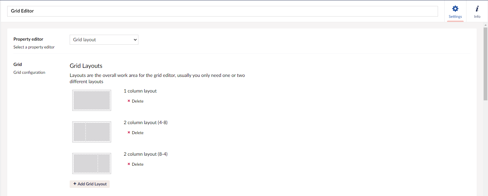
For each of the layouts, the number of columns per layout section must be defined. For my 1 column layout, I have defined the width as 12. I can also choose the row configurations available for the layout or allow all row configurations. The layout configuration defines the layout options available for the page.
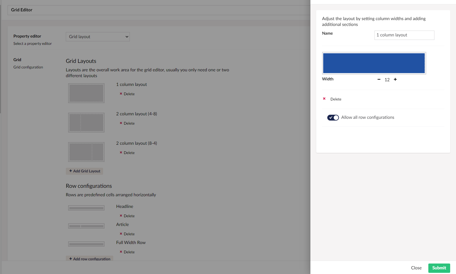
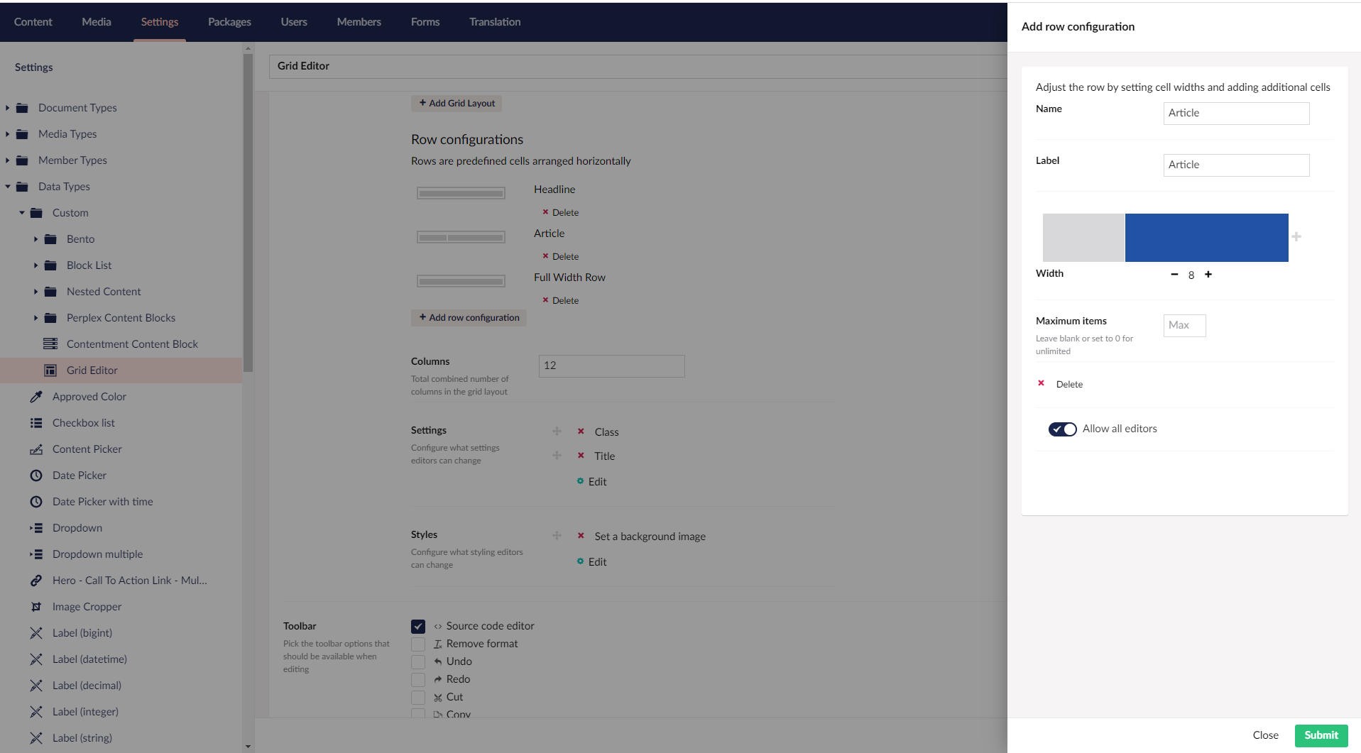
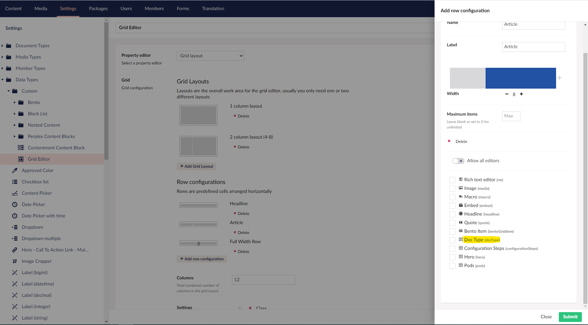
The next step is to define the row configurations for the Grid Layout. This is where the content goes. You can have multiple row configurations with one or more cells. A full-width row has a single 12-column wide cell in my example. An article row configuration has 2 cells of widths 4 and 8 each in my example. Within each cell all or a set of editors can be allowed which helps insert different types of content into the rows. You can also limit the number of items in a cell by specifying the Maximum Items.
Grid Editors
Grid Editors are components that help enter content into the grid rows. There are two ways to define grid editors.
- Creating custom Grid Editors using AngularJS
- Using Document Type Grid Editors
Out of the box, Umbraco ships with a few basic grid editors. They are specified in the file /config/grid.editors.config.js. You can create your own grid editors for more complex components or components which are specific to your website. This requires AngularJS knowledge. If you wish to achieve an editing experience similar to that of the backoffice with the various dialogs, content & media pickers, etc you will need to also pick up on the Umbraco Backoffice UI APIs.
To understand how to create a custom grid editor, you can use the official Umbraco documentation which contains a very good tutorial on the same.
This is all good but requires a lot of developer effort to build a custom grid editor and for large websites with a lot of components, a lot of development time can go into developing these grid editors alone unless you maintain a lot of them internally in your team.
Another way to have custom grid editors is to use macros in the grid cells. But there are very few parameter types you have with macros and again, a lot of developer effort to create and support new parameter types.
Points to remember
- Preview of content in the backoffice
- Settings can be applied to rows and cells and they can be maintained away from the content editor flow
- Available out-of-the-box
- No Models Builder support for the grid editors. You can use Skybrud GridData to make your render partials strongly typed.
- No validation in the back office. It has to be handled in the custom grid editor.
- There is a learning curve with AngularJS. Also, the Umbraco backoffice UI APIs if you wish to give editors a consistent editing experience.
- Additional development and testing time needed for developing and testing custom grid editors.
- Grid Layout is Bootstrap-based. Extra work will be required to make it work with other CSS libraries.
Use Cases For The Grid Layout
- As an RTE replacement
- Enter pre-configured types of content into preconfigured layouts.
Doc Type Grid Editor (DTGE)
If you do not want to create custom grid editors or use macros inside your grid cells you can use the Doc Type Grid Editor(DTGE) package. DTGE is a grid editor that uses element types as the blueprint for inserting complex data into grid cells. The package was originally built by Lee Kelleher and Matt Brailsford for Umbraco V7. It was a very popular package in V7 and Søren Kottal did the most amazing work of porting the package to V8. He now maintains the package. What a fab effort!
With DTGE, you create element types and these element types can be used to insert content into the grid cells. These element types become your grid editors. For every cell in a row, grid editors can be specified. Editors get a consistent editing experience that is in line with the backoffice with very little developer overhead. You can also provide a preview of the content inside the backoffice to your editors. It is also possible to tailor different views for website rendering and previews inside the backoffice.
DTGE can be installed as a NuGet package.
Install-Package Our.Umbraco.DocTypeGridEditorOnce installed, you can see a package.manifest in the App_Plugins/DocTypeGridEditor. It has a default configuration for a grid editor called Doc Type. You can allow this grid editor in your grid row configurations and all allowed element types for this grid editor will be available for your editors in your row configurations.
Let's have a look at the configuration options for DTGE.
 "gridEditors": [
    {
      "name": "Doc Type",
      "alias": "docType",
      "view": "/App_Plugins/DocTypeGridEditor/Views/doctypegrideditor.html",
      "render": "/App_Plugins/DocTypeGridEditor/Render/DocTypeGridEditor.cshtml",
      "icon": "icon-item-arrangement",
      "config": {
        "allowedDocTypes": [ "element" ],
        "nameTemplate": "",
        "enablePreview": true,
        "overlaySize": "medium",
        "viewPath": "/Views/Partials/DocTypeGridEditors/",
        "previewViewPath": "/Views/Partials/DocTypeGridEditors/",
        "previewCssFilePath": "~/css/dtge.css",
        "previewJsFilePath": ""
      }
    }
]- allowedDocTypes - An array of aliases of the allowed element types for this grid editor. It can also do some Regex pattern matching. In my example, all element types with alias starting "element" will be allowed in the Grid Editor. If multiple element types are matched a dialog comes into view which lists all the allowed element types to help the editor make the selection.
- nameTemplate - Allows use of property alias in the name/label of the grid editor in the backoffice
- enablePreview - Determine whether to render a preview in the backoffice. By default, the website rendering partial will be used for preview rendering.
- overlaySize - Specifies the size of the Grid Editor dialog. Allowed values are small, medium(8.3+) and large
- viewPath - Path to the partial views for the Grid Editor rendering. If left unconfigured defaults to
~/Views/Partials. DTGE looks for a partial with the same name as the element type in the location - previewViewPath - Alternative view path for rendering the preview inside the backoffice
- previewCssFilePath - CSS file path for preview partials
- previewJsFilePath - JS file path for preview partials
- showDocTypeSelectAsGrid - displays the allowed element types as a grid along with their descriptions
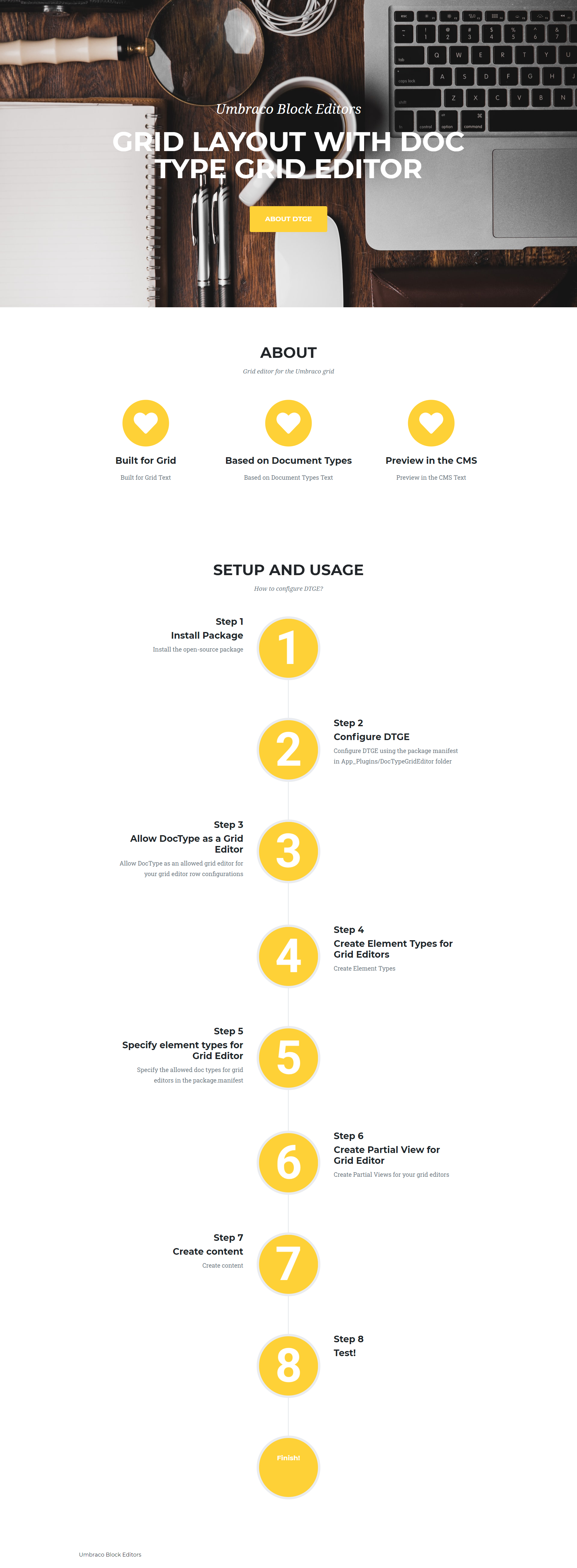
In this article am going to build a page that looks as shown below and I will be explaining the configuration and code to build the Hero component. Code for the entire page is available in my repo.
If you want to allow specific element types as grid editors in specific cells of your grid rows, you can set up each element type as a grid editor and allow them as a grid editor in your row configuration.
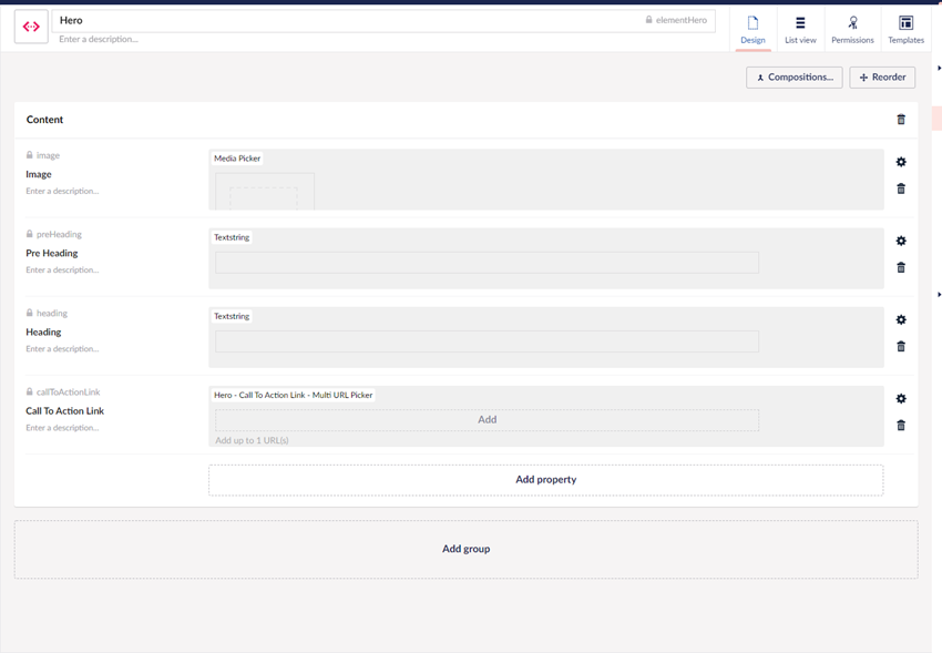
The element type for my Hero grid editor is shown below. The element type is called Hero with the alias elementHero.
Rendering Grid Editors
To render the grid editor on the page I add a partial called ElementHero.cshtml in the folder /Views/Partials/DocTypeGridEditors/ which is specified as the path to the partial views for my grid editors. And shown below, is the code.
@inherits UmbracoViewPage<ElementHero>

<header class="masthead" style="background-image:url('@Model.Image.Url')">
    <div class="container">
        <div class="masthead-subheading">@Model.PreHeading</div>
        <div class="masthead-heading text-uppercase">@Model.Heading</div>
        <a class="btn btn-primary btn-xl text-uppercase js-scroll-trigger" target="@Model.CallToActionLink.Target" href="@Model.CallToActionLink.Url">@Model.CallToActionLink.Name</a>
    </div>
</header>
Since the grid editors are based on element types, I get Models Builder support, so all my partial views can be strongly typed.
My example is rather simple and does not have any business logic in the view. Should you need to do some processing in your views and do not wish to have business logic in your views you can move the logic into a controller. To achieve this you can make use of the base surface controller that DTGE provides called DocTypeGridEditorSurfaceController. You can create a surface controller that inherits from this surface controller following the naming convention <docTypeAlias>SurfaceController where docTypeAlias is the alias of your element type. The surface controller also expects an action with the same name as the alias of the element type. So if I am to rewrite my above grid editor using surface controller the code for it would look like below
public class ElementHeroSurfaceController
	: DocTypeGridEditorSurfaceController
{
	public ActionResult ElementHero()
	{
		// process....
		return CurrentPartialView();
	}
}
Within the surface controller, you have access to the following
- Model - The
IPublishedElementinstance of the element type - ViewPath - Reference to your view path configured in package.manifest
- CurrentPartialView(object model = null) - Returns the default partial view for the Grid Editor. If no model is passed in, the standard Model will be passed down. You can also pass in a custom view model.
- PartialView(string viewName, object model = null) - Helper method to return an alternative partial view for this cell. If no model is passed in, the standard Model will be passed down
DTGE is supported on Umbraco V8.1+.
DTGE also supports preview of content in the backoffice. Information on it can be found here. I also have an example in my repo.
Points to Remember
- Works seamlessly with Models Builder
- Validation in document types available for editors
- Preview can be tailored with editors having a preview different from the website rendering
- Settings can be applied to rows and cells and they can be maintained away from the content editor flow
- With DTGE you an introducing a dependency to a package, but DTGE is a very well supported package.
Use Cases For Grid (DTGE)
- If you are committed to the Grid Layout, DTGE can be a really good way to use the Grid Layout for complex layouts on the website.