Umbraco Block List
This is the third article in the series of the various block-style editors for Umbraco.

The Block List is a list editing property editor. It is based on an RFC that was put together after the CG Retreat in 2019. Block List was introduced into the Core with V8.7
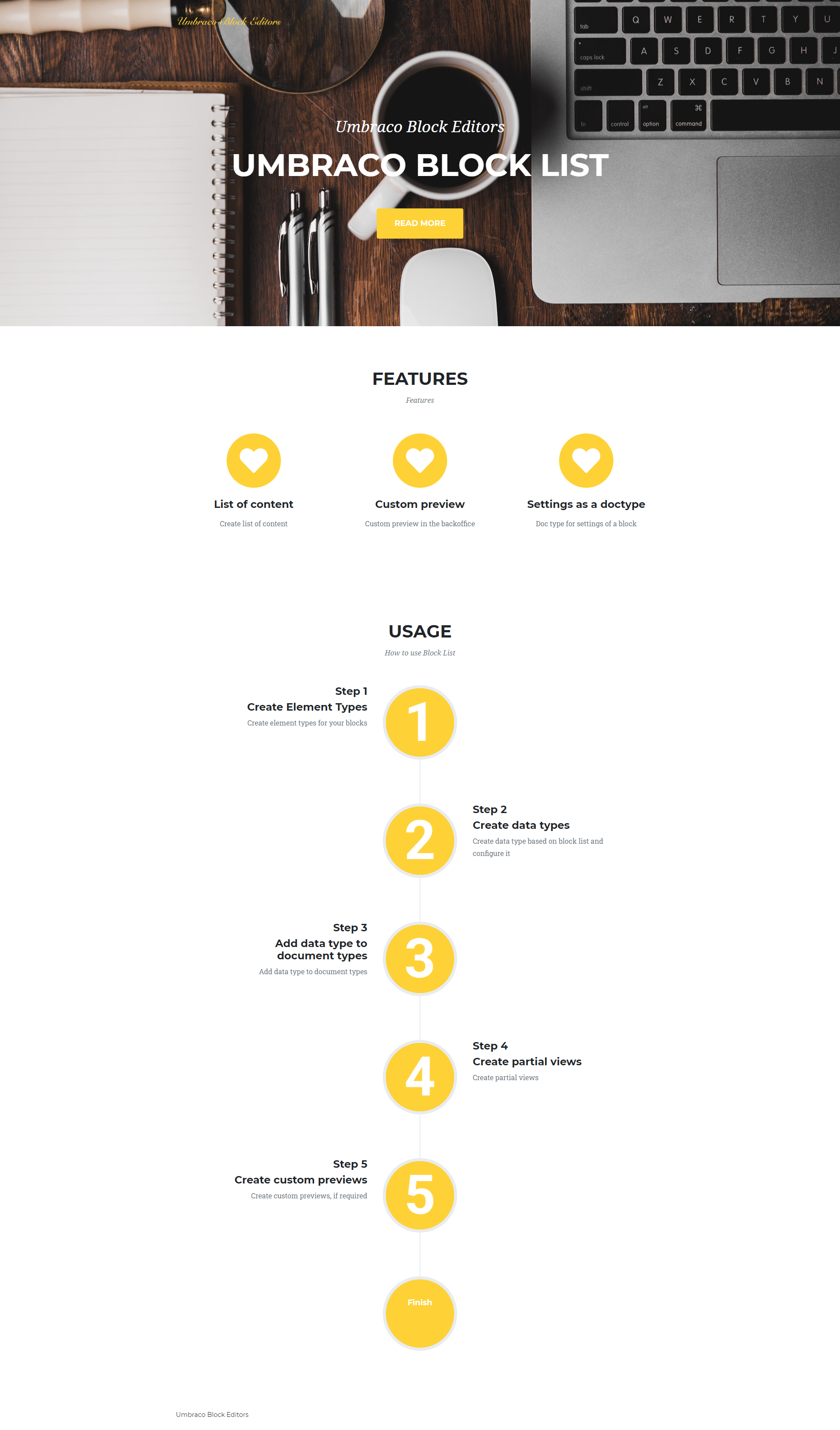
To demo the setup and usage of the Block List I am putting together a page that looks as shown below. I will be showing the configuration and code to build the Hero component. Code for the entire page is available in my repo.
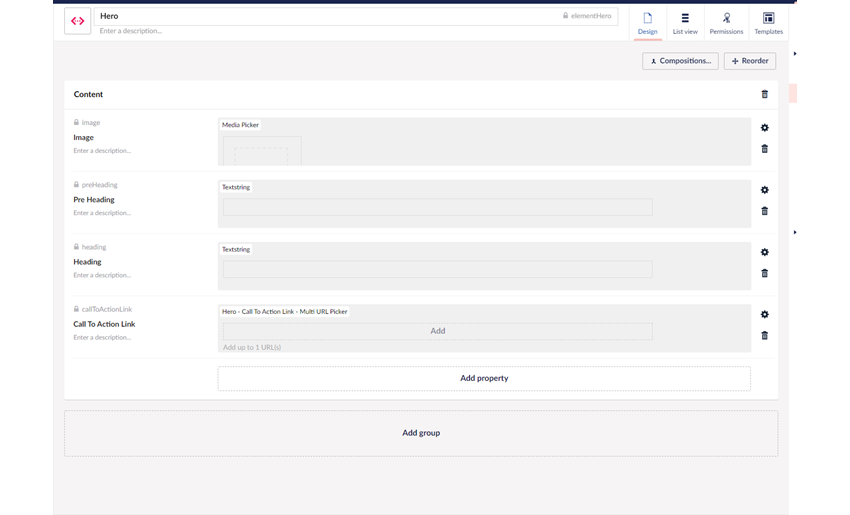
Element Types form the basis of Block List. My Hero element type is shown below.
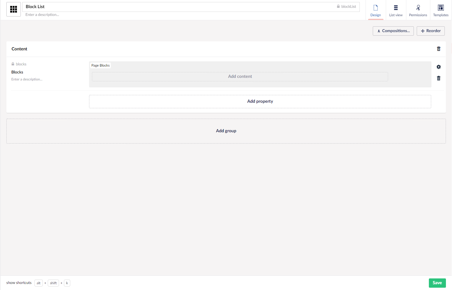
Once I have saved this element type I can create a data type based on the block list.
Data type Configuration
The best part about the data type is that you can add existing element types as an available block or you can even click the "Add" button and create a new element type. The infinite editor overlay comes into the view and you can create a new element type. It's a really nice touch!
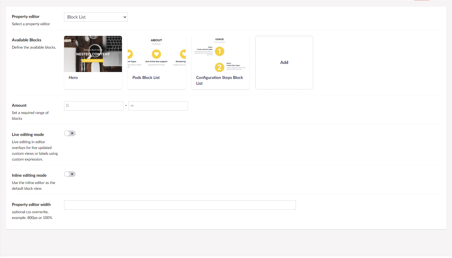
From here on I can configure the data type itself as well as configure some settings for each of the blocks. Let us have a look at the data type configuration first.
- Amount - The required number of blocks. It can range from 0 to infinity or you can specify a number. Setting a value other than 0 for the minimum would mean editors will need to add that many blocks of content.
- Live Editing Mode - The default editing mode of a blocklist features an overlay where the content editors enter their content. With live editing mode turned on, changes to the content appear in the backoffice as you type them.
- Inline Editing Mode - This changes the editing experience to be very similar to Nested Content. You can still have backoffice previews but the content editing happens from the main CMS content area rather than an overlay.
- Property Editor Width - Sets the property editor width in the CMS. Can be a value in % or px.
This is data type configuration done. But we have more goodies with the Block List because we can configure each block available to the block list data type. To configure a block, click on the block and an overlay opens. The configuration of my Hero block is shown below.
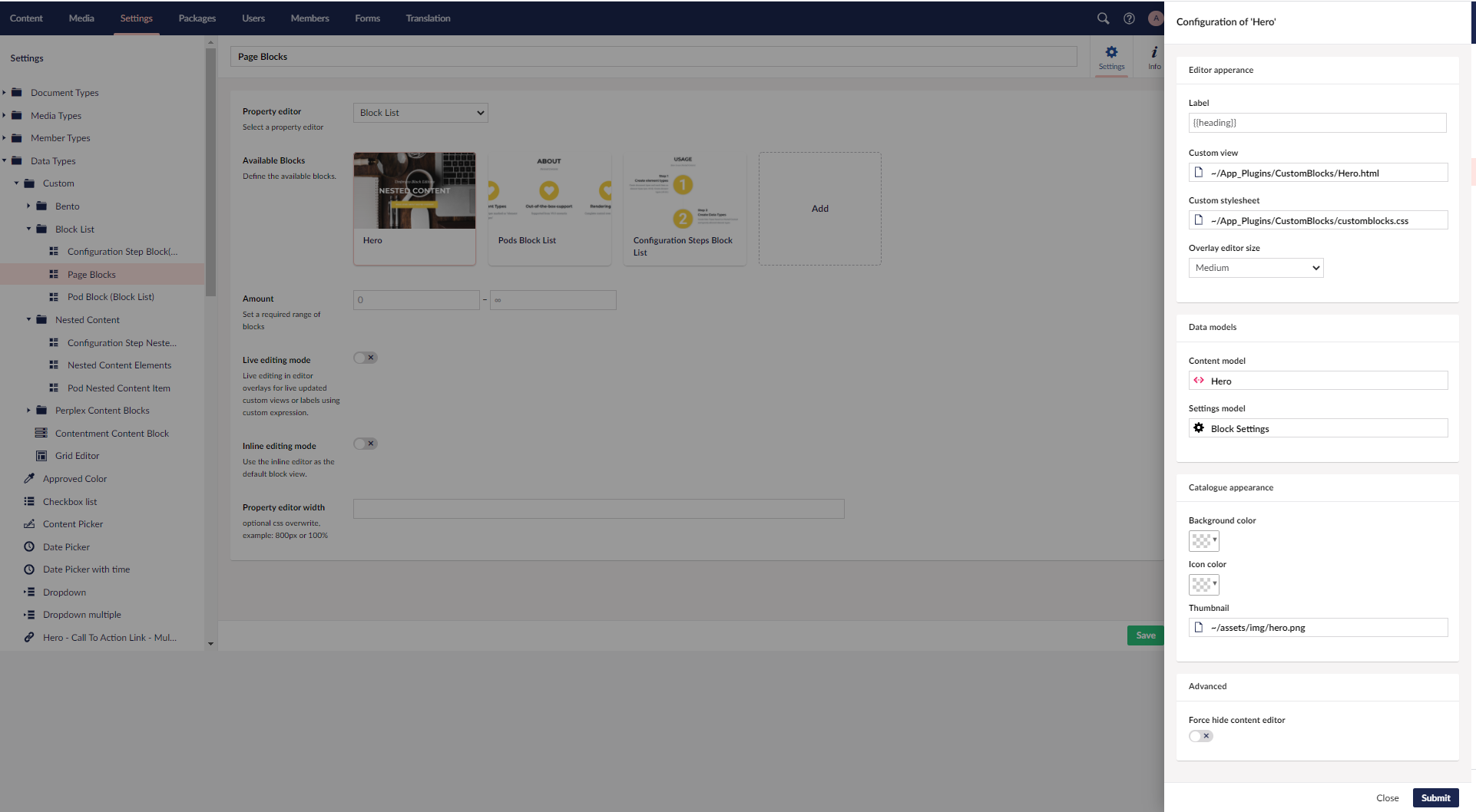
It's split into 4 different sections. Let us discuss each of the sections.
Editor Appearance
- Label – name template that shows in the editor for your content. Again very similar to the nested content name template, you can use AngularJS syntax to provide labels for eg for a property with alias heading we can have {{heading}} as the AngularJS syntax
- Custom View - If you wish to present your editors with a more visual representation of the block you can specify a custom view. You can build complex previews of content yourself and this is to be used in tandem with the live editing mode where you can actually see the content being updated or in conjunction with the default mode(overlay) to present a better preview of the content. With inline editing mode it defaults to the Nested Content way of editing and this view cannot be used. The view is an AngularJS View and you can even enhance the experience using a controller and hooking into the various backoffice resources. An example can be found here. You can put the view and controller in a folder in the App_Plugins folder.
- Custom Stylesheet - You can specify a custom stylesheet for your custom view and the styling of the block will become scoped. This means backoffice styles are no longer available with the custom view.
- Overlay editor size - Set the size for the Content editor overlay for editing this block.
Data Models
With the block list, the settings for the block can be separated from the content.
- Content Model - The model for the content of the block, effectively your element type.
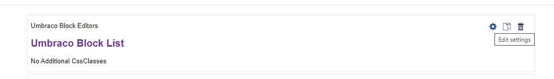
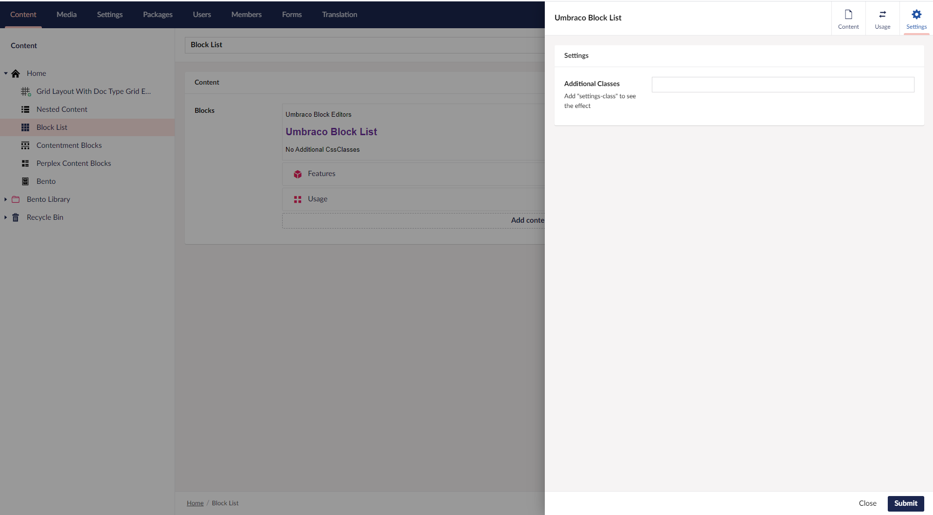
- Settings Model - The settings model for the block. An element type can be specified as the settings model. When specified this presents the editors with a like cogwheel icon by the block to edit settings. It also gives a settings section in the overlay for editing the block
Catalogue Appearance
The config specified here controls the appearance of the block in the Block catalogue. Block catalogue is the overlay that comes into view when editors wish to add a new block.
- Background colour - Specify a hex code, it will then show up as the background colour beneath the icon of the element type in the Block catalogue
- Icon Color - Change the colour of the element type icon
- Thumbnail - This is an absolute winner of config for me. I can specify a thumbnail for the block and that will show up in the catalogue as well as the data type. You might have noticed some thumbnails in my data type config above. A 16:10 image of size 400px by 250px is recommended.
Advanced
- Force hide content editor – This had me confused a bit and I am assuming some things here going by the documentation. It looks like you can create a custom editing experience like the grid layout for default editing mode. The default editing mode has the overlay coming out and you can force to hide that.
I can now add the data type to my document type. Here is my document type.
Rendering on website
There are 2 ways of rendering block lists.
Default Rendering
The block list ships with a built-in rendering mechanism. There is a HtmlHelper called GetBlockListHtml() which can be used to render the block list. The helper method takes a property alias as a parameter.
//Models Builder
@Html.GetBlockListHtml(Model.Blocks)

//Without using Models Builder
@Html.GetBlockListHtml(Model, "blocks")
We also need a partial view for each block. The partial views must reside in the folder Views/Partials/BlockList/Components and the partial view must be named by the alias of the corresponding element type. The partial view receives a model of the type Umbraco.Core.Models.Blocks.BlockListItem. This model consists of two parts - the content model and the settings model. Model.Content gives the content model. Model.Settings gives the settings model. They can be cast to their corresponding Models Builder models to strongly type your views.
More information on default rendering can be found here.
Your own rendering
With block lists, developers get full control over rendering and can build their own rendering mechanism. In my example I am using my own rendering.
Let us start with the template for my document type. In my template, I can access Model.Blocks which gives me an IEnumberable<BlockListItem>. I loop through the IEnumberable and try to call a partial which resides in the folder Views/Partials/BlockListPartials. Unlike the default rendering, the partials can go in any folder with your own rendering.
@foreach (var block in Model.Blocks)
{
    //block.Content gives the content model
    @Html.Partial($"BlockListPartials/{block.Content.ContentType.Alias}", block)
}
Each item in the IEnumerable is a BlockListItem which has got both content and settings model. I use a naming convention whereby my partials are named after the alias of the content model of the block list item. I pass in the BlockListItem in its entirety so that I have access to both settings and content in my partial.
And this is what my partial view looks like
@inherits UmbracoViewPage<Umbraco.Core.Models.Blocks.BlockListItem>

@{
//get the content model
    var contentModel = Model.Content as ElementHero;
//get the settings model
    var settingsModel = Model.Settings as BlockSettings;

    <header class="masthead @settingsModel.AdditionalClasses" style="background-image:url('@contentModel.Image.Url()')">
        <div class="container">
            <div class="masthead-subheading">@contentModel.PreHeading</div>
            <div class="masthead-heading text-uppercase">@contentModel.Heading</div>
            <a class="btn btn-primary btn-xl text-uppercase js-scroll-trigger" target="@contentModel.CallToActionLink.Target" href="@contentModel.CallToActionLink.Url">@contentModel.CallToActionLink.Name</a>
        </div>
    </header>

}
There is more information about building your own rendering here.
Previews in Backoffice
Block List supports preview in the backoffice. For this, a custom view has to be specified for the block when it is configured in the data type. A custom stylesheet can also be specified to make the styling of the block scoped. The previews in backoffice are HTML and AngularJS based. More information on building custom previews in backoffice can be found here. I also have an example in my repo.
Business Logic in Controllers
The ability to move any business logic into controllers is not something that ships with Umbraco Core, but this can be achieved thanks to Søren Kottal's package.
Use Cases
Block List can be used to create blocks of content and build versatile landing pages. Its not a layout builder by default but a great article on how to use Block List to build layouts can be found here.
Points to Remember
- Block List is supported on V8.7+
- Feels very Umbraco in the implementation
- Ability to have custom previews in the backoffice
- Ability to provide editors with a very visual block catalogue
- Ability to copy single/all items and paste them on another page
- Settings and Content are separate models
- For block list with nested items, they need to be set up as block list data types and added to the main element type
- Custom previews in the backoffice can involve a learning curve. For custom implementations developers require knowledge of AngularJS
- Block List will be supported in Umbraco Unicore
- Block List Editor
- Grid Nouveau and other fun stuff with Block Lists - article written by Søren Kottal for 24 days in Umbraco, 2020 edition